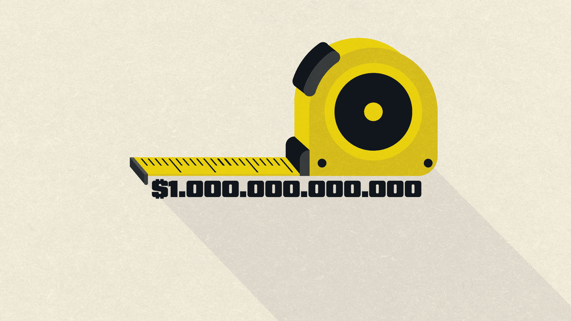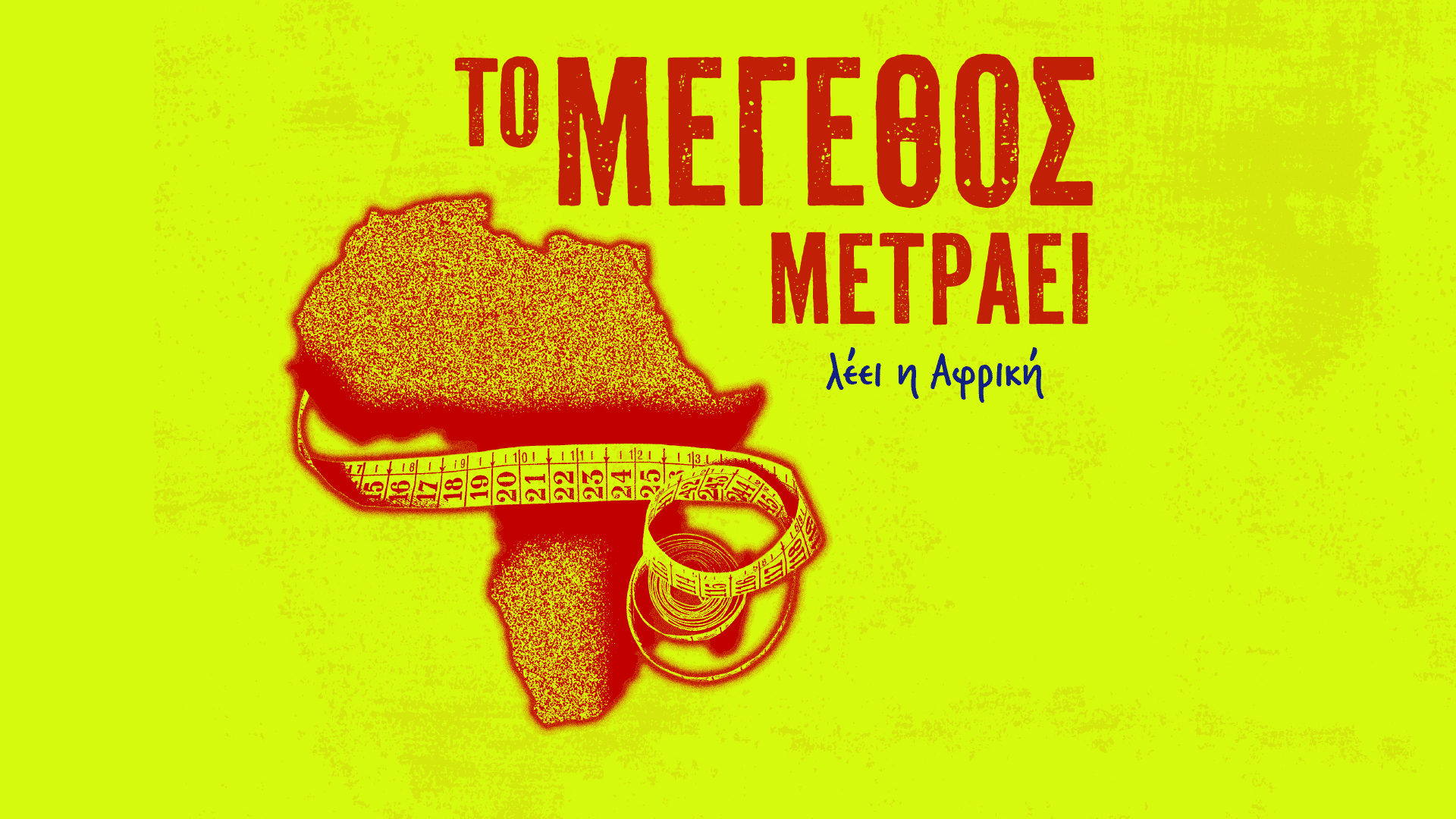
- Small on the map…
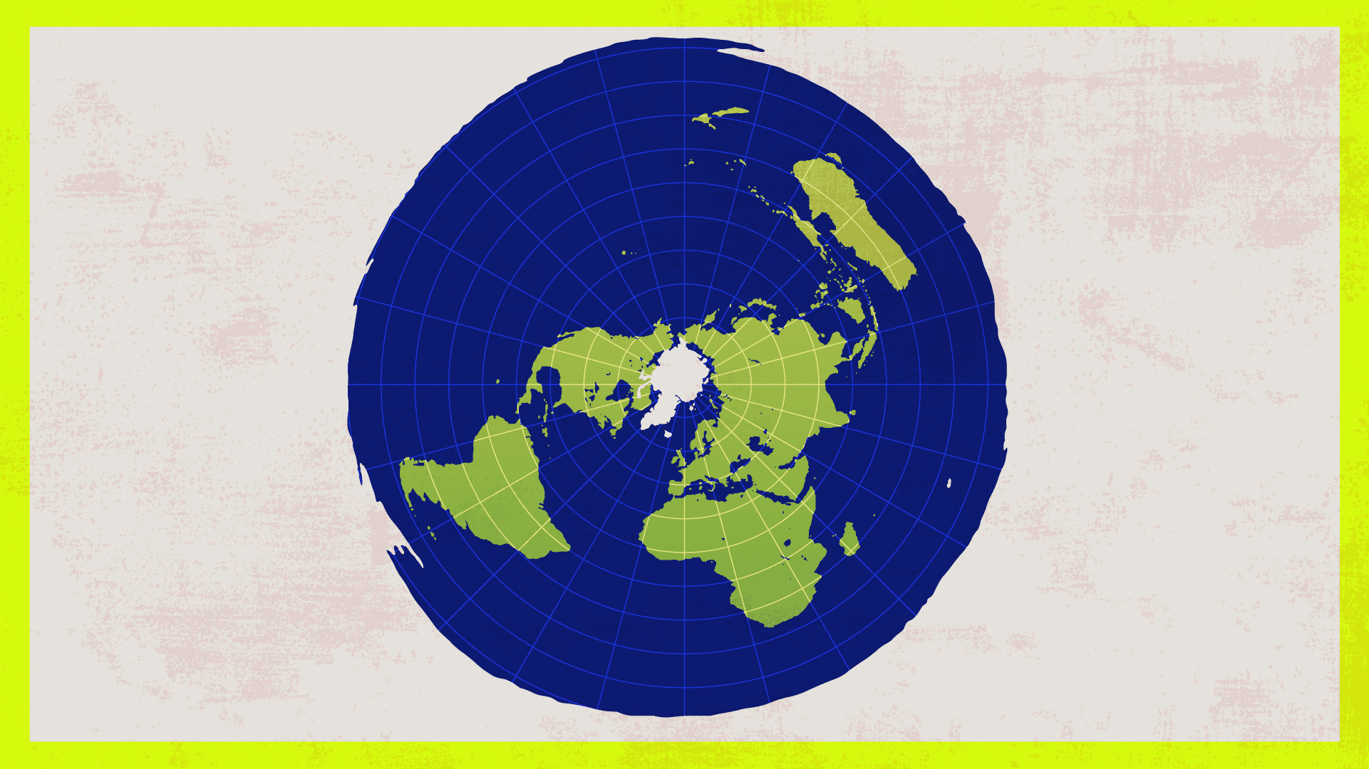
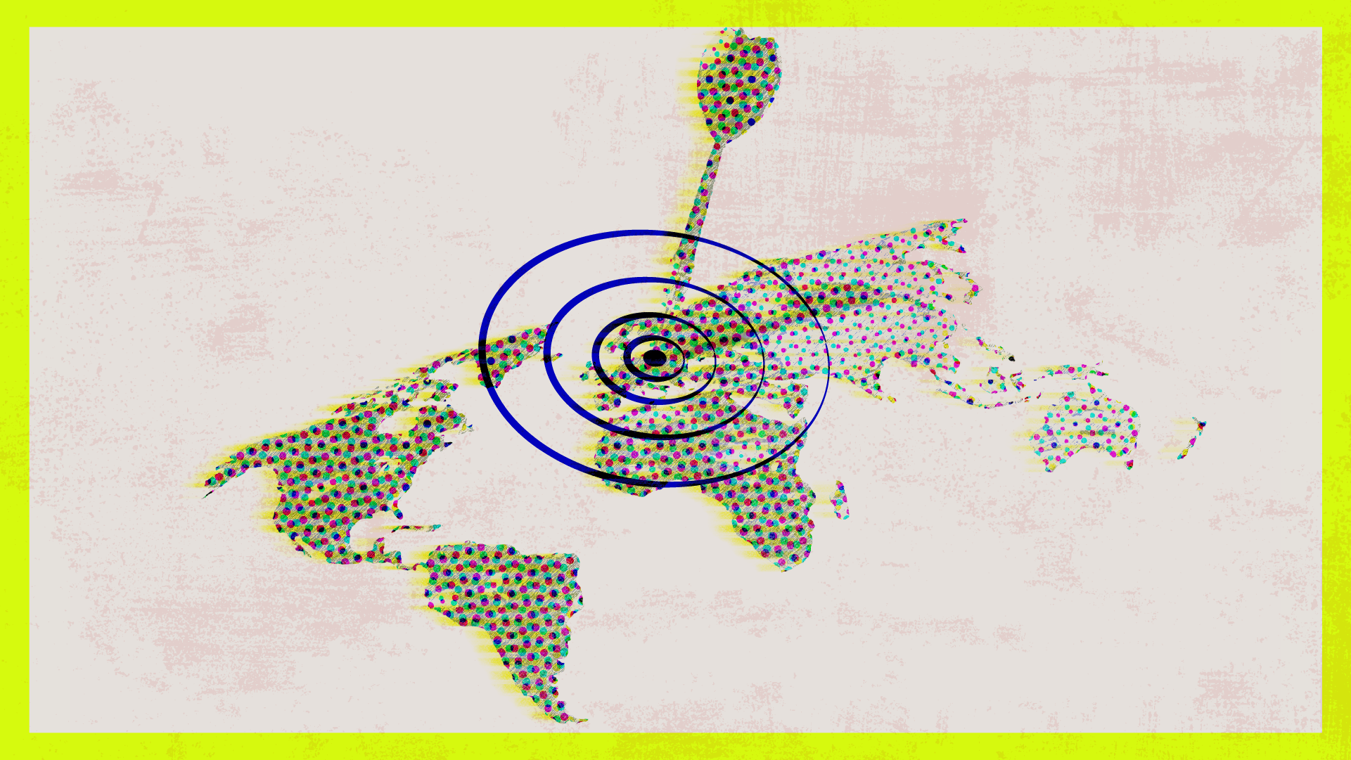
- The Mercator projection is to blame
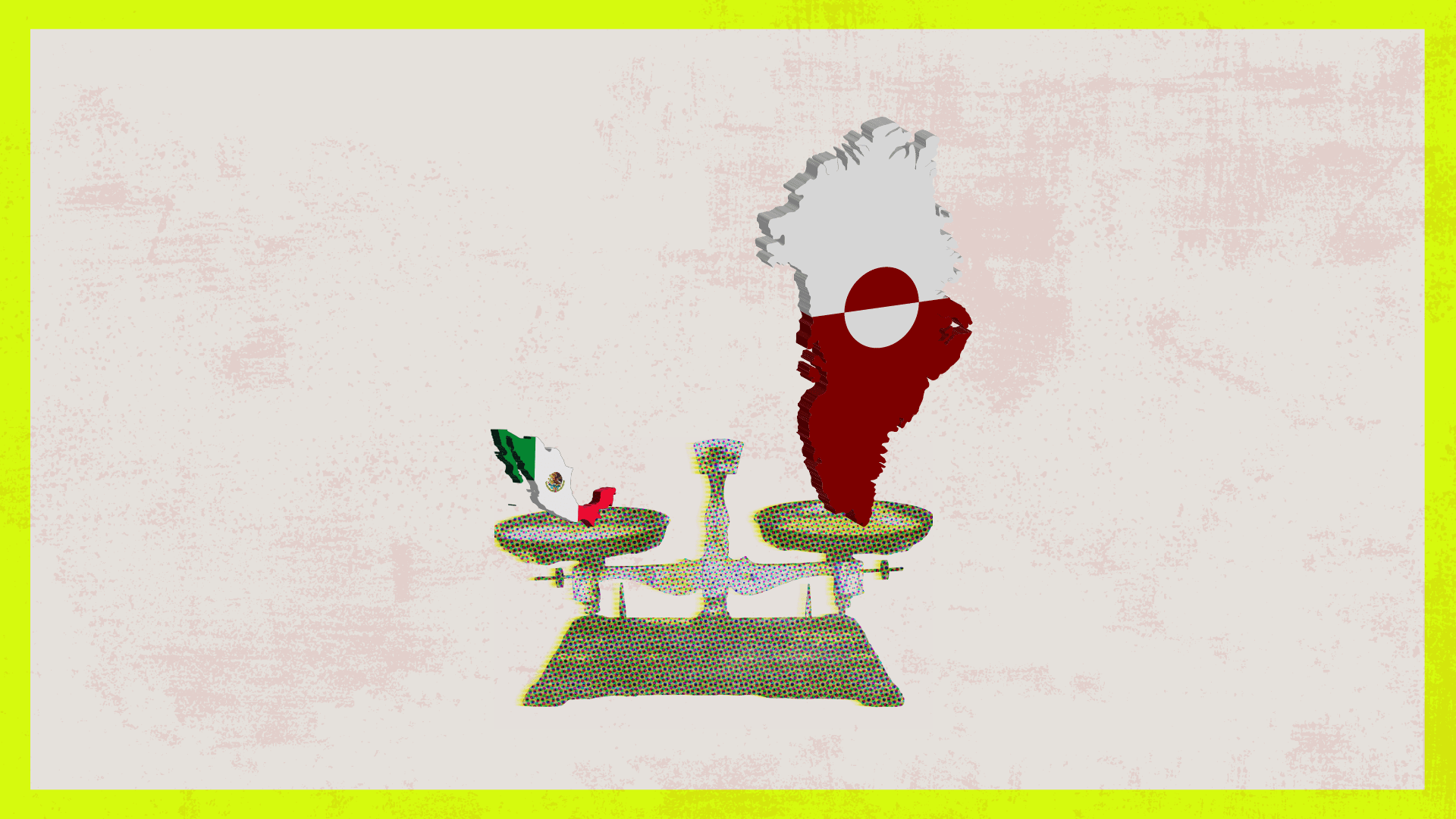
- Some examples
- Maps and colonialism
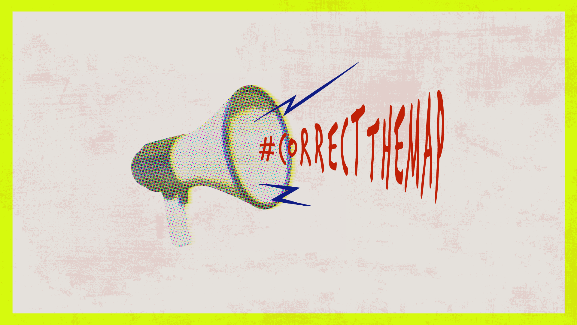
- Have maps been back in the spotlight?
- Mercator maps and technology
- Is there a “perfect” map?
- Conclusion
- Sources


ForYourInformation: